Assisting Vision: Using Colour Shifting and Shading
Colourblindness is one of the more common issues that impact the
usability of visual interfaces. It is estimated that 1 out of 20 visitors
to a website have some type of colour vision deficiency [1].
There are many different types and degrees of colourblindness.
Colourblindness can affect accessibility of any coloured materials,
whether or not meaning is attached to those colours. Have you ever
visited a personal website that you found impossible to read because of the
font colour and the background? Or maybe you can read the content but it
takes a lot of effort. Colour is often used to present content in a way
that is thought to be more appealing to the reader. It is also used to
attract attention to specific information. However, the problem is the
reader might not be able to read the content because of the colour.
The following video gives an overview of the effects colourblindness
has on people's lives.
This ADE first demonstrates the problem, and then demonstrates how
colour shifting could provide a means to make multi-colour displays more
accessible to people with colourblindness.
Note: JavaScript is needed for this ADE. See
the Technical Help Page for guidance on
enabling this technology.
What to do:
- The Colorblind
Web Page Filter website provides a tool that allows you to enter a
web page address and simulate what a web page looks like to someone
with colour blindness. We will be using this tool for this
activity.
View the URL http://www.tracyskarate.com/ using the various filters and
answer the following questions.
- Is the
website accessible to users with colourblindness? Why or why not?
- List 3 problems that users with colourblindness may have using
this website.
- What improvements can be made to resolve the problems you
identified?
- Many people use colour to indicate importance or to put emphasis
on certain words. How else can they communicate this such that
those with colour blindness can understand as well?
- Go to the Colour
Contrast website and complete the activity.
- How many of the words did you get correct?
- Did you have difficulty reading any of them? Why or why not?
- What criteria do you think should exist when choosing colours
for foreground and background?
- Take the Colour Quiz
and see the difficulties one can experience when it comes to
colours.
- What difficulties (if any) did you have in answering the questions?
- There are tools available that shift the colours on the screen to
colours that are visible to the user. In this activity, we will be
using Ryobi System Solutions' tool called Visolve.
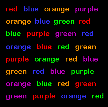
Use this image of the
stroop test [2] as
the input. Try the various transformations on the three different
simulations.
- For each of the simulations, which transformation(s) was
helpful or made the most improvement to what a person with
a colourblindness sees?
- In what way would this type of tool is helpful to those with
colourblindness? Website developers?
What to hand in:
Hand in a report that answers the 10 questions above, as well as the
feedback below.
Feedback
- What were your expectations of this ADE?
- Did this ADE meet your expectations? Provide a rating between 1 and
7, where 1 means not at all, 4 means somewhat, and 7 means
absolutely. Please explain your choice.
- Did you feel that the video(s) for this ADE was appropriate? Why or
why not? Provide a rating between 1 and 7, where 1 means not at
all, 4 means somewhat, and 7 means absolutely. Please explain your
choice.
- Do you have any suggestions for other possible videos?
- Did you feel that the questions above got you to think about the
real and serious issues regarding this ADE? Provide a rating
between 1 and 7, where 1 means not at all, 4 means somewhat, and
7 means absolutely. Please explain your choice.
- If you have any suggestions on how to improve this ADE, please
include it here.
References
[1] About Vischeck. 2002. http://www.vischeck.com/vischeck.
[2] The image was retrieved from
http://www.wooster.edu/psychology/abnormal/stroop.gif.
